Lam Partners
To celebrate their 60th anniversary, Lam Partners, a lighting architecture and design firm, partnered with Owen Jones to develop an identity that seamlessly communicated their creative vision and craft. What started as a brand ask evolved into a deeply collaborative effort to define brand fundamentals, establish a lasting identity and outlook, and ensure Lam showed up consistently in every experience and conversation.
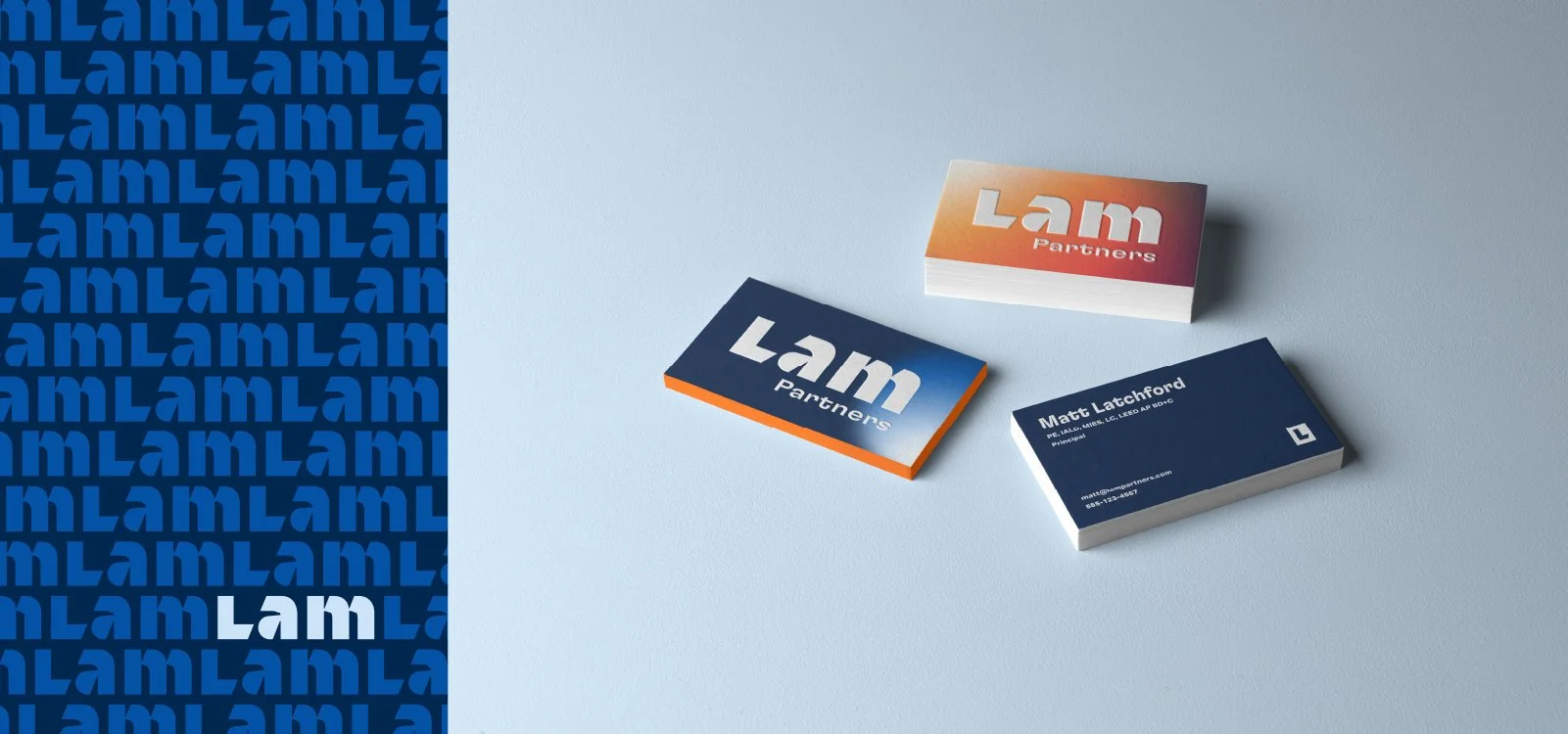
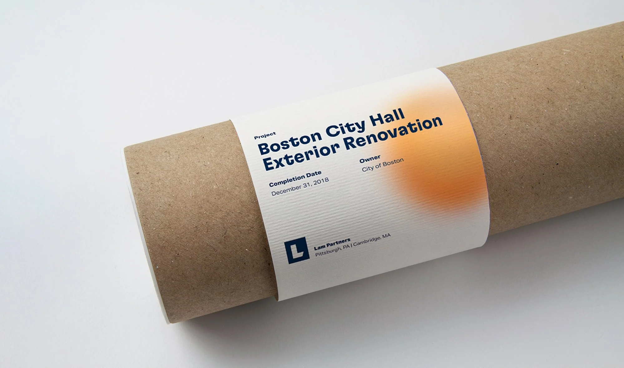
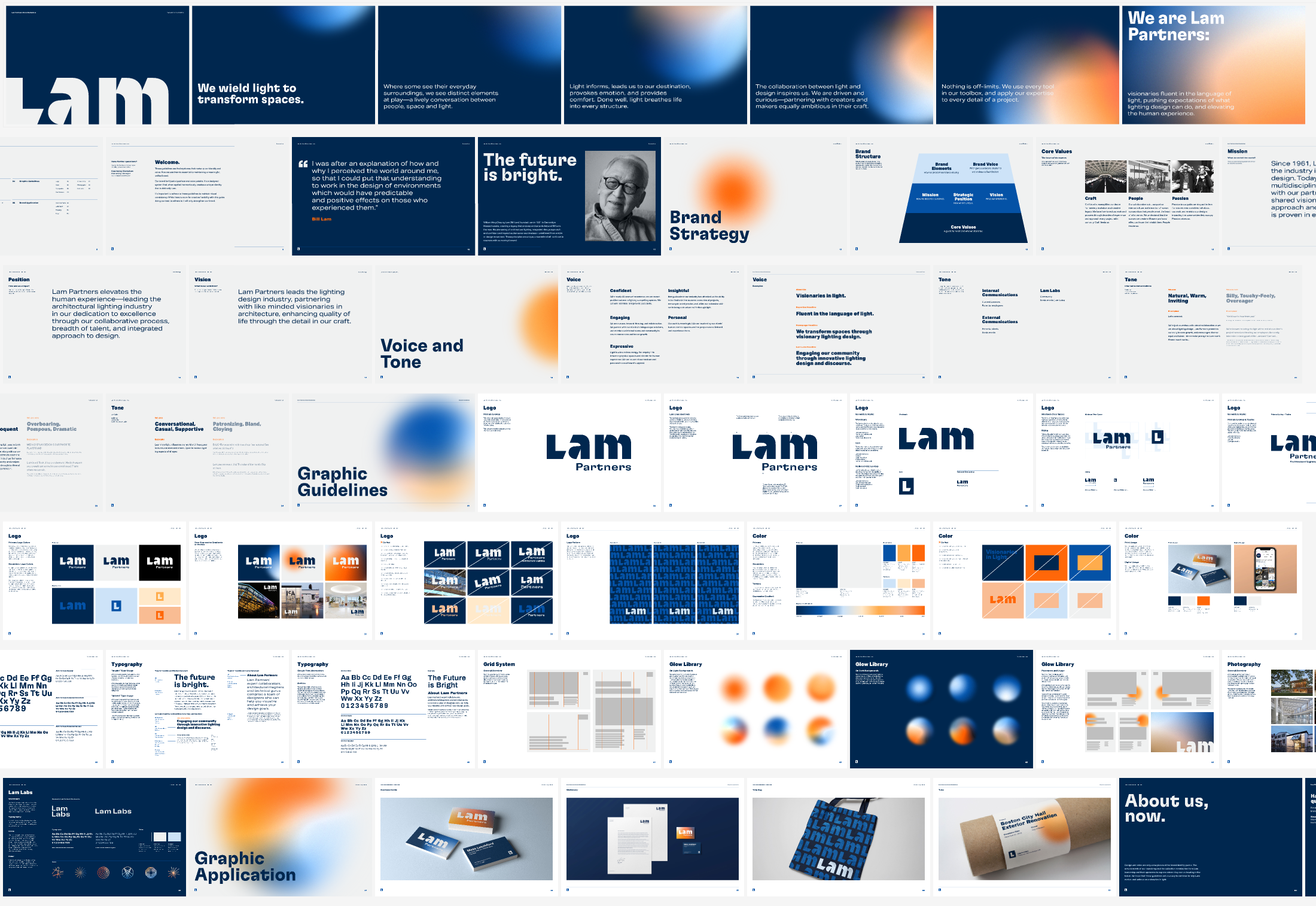
The end result included brand guidelines (complete with a glow library) that expressed more than a flexible brand identity — it became a storytelling narrative that sparked an emotional connection at every touchpoint.
Associate Creative Director: Laura B Stull
Art Director: Lisa Oliver
Designers: Meg Odell, Bryony Redhead, Jess Lyons
Copywriter: Jake Cann
TEAM
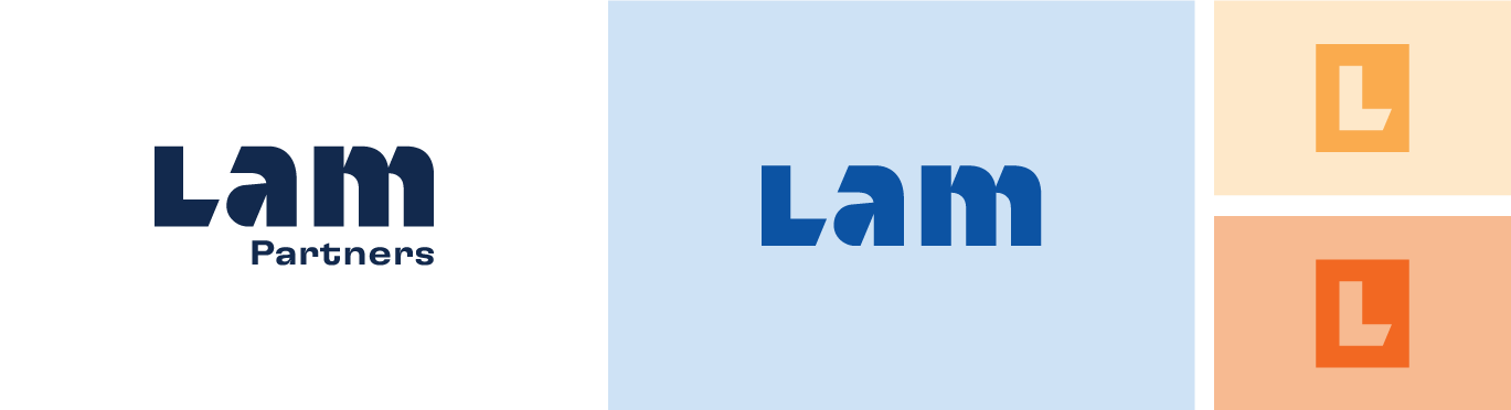
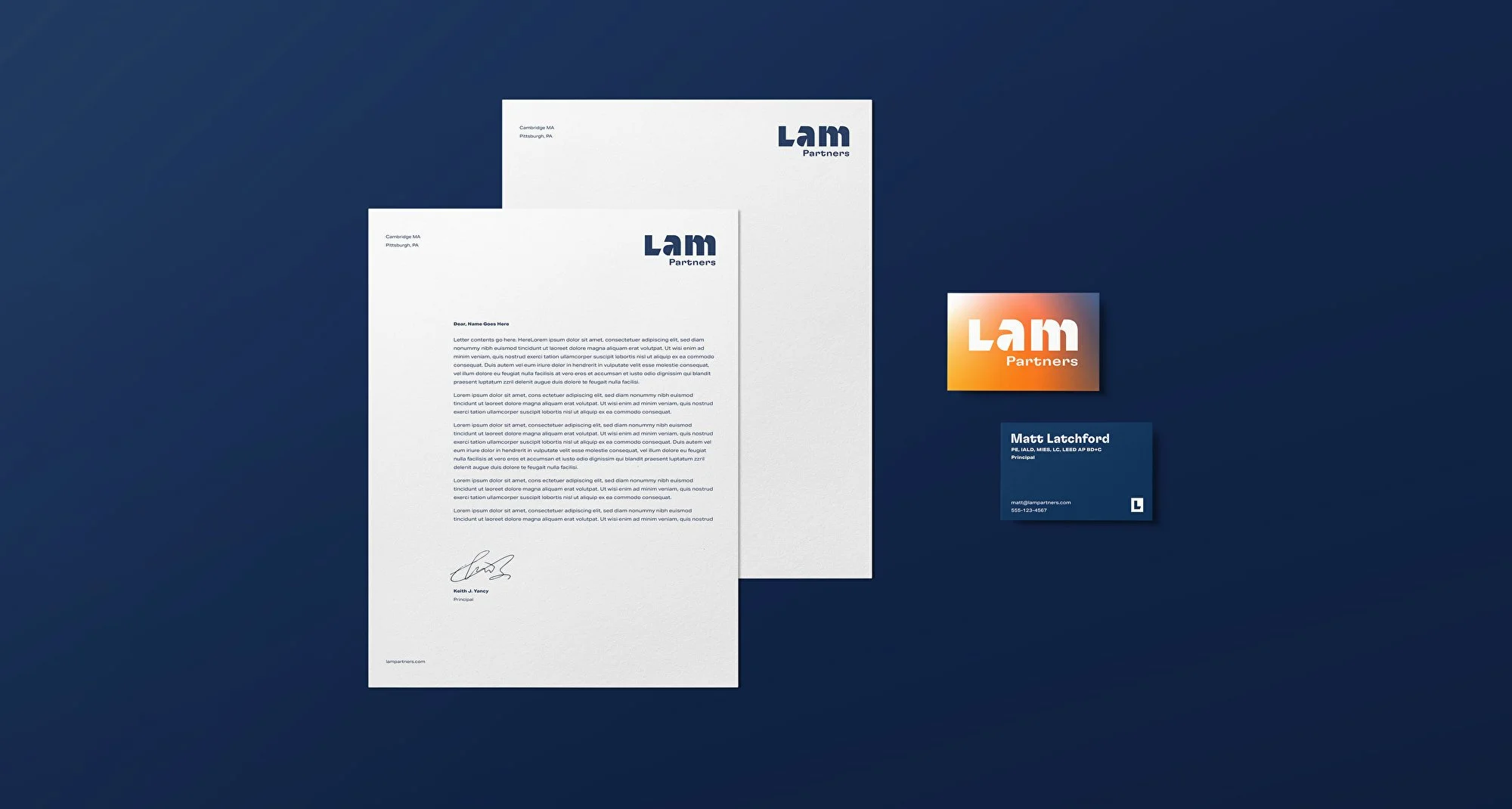
Lam’s logo letterforms began as a stencil font, inspired by a standard practice in architecture schools worldwide, and were then customized to illustrate that manner in which light transforms spaces. The ‘L’ represents a door casting a shadow, while the notched counter spaces in the ‘a’ and ‘m’ are reminiscent of an emanating beam of light.
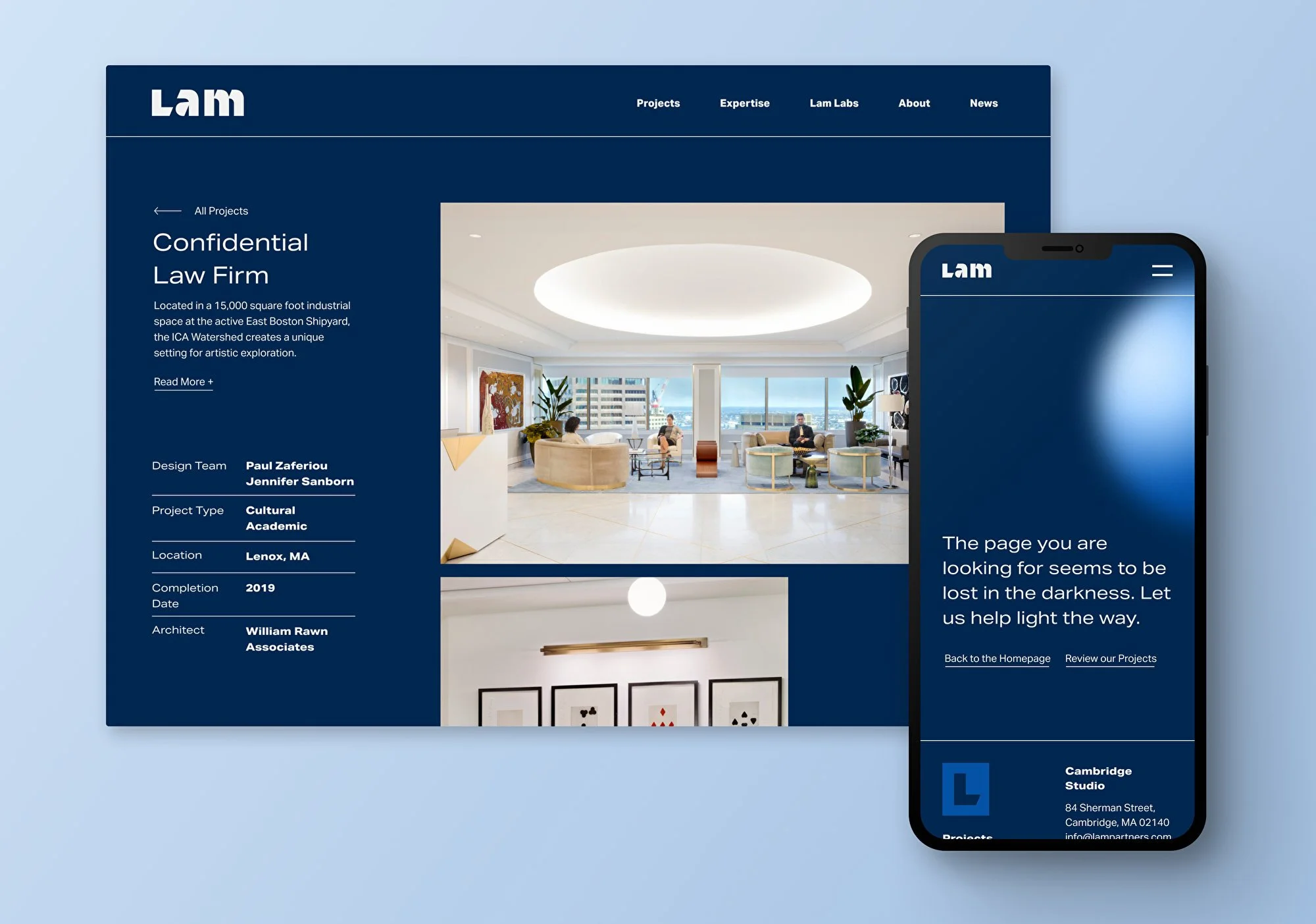
The accompanying website we developed applied their new brand using custom-built blocks, automated content migration, and provided a simple and accessible editing and site management experience for the Lam team.